Choosing the perfect carpet color for your child's room can feel overwhelming with endless options available. The right carpet color doesn't just complement your decor—it sets the foundation for the entire room's atmosphere, influences your child's mood, and creates a cohesive design that grows with your family.
At Booom Jackson, we understand that carpet color selection involves much more than personal preference. It requires considering existing furniture, wall colors, lighting conditions, your child's age and personality, and long-term design flexibility.
According to interior design experts at Better Homes & Gardens, successful color coordination in children's spaces requires balancing stimulating elements with calming foundations. The carpet often serves as this crucial foundation, anchoring all other design elements while providing comfort and functionality.
Understanding Color Theory for Kids' Spaces
Before diving into specific color choices, it's essential to understand basic color theory principles that guide successful room coordination:
The Color Wheel Foundation
The traditional color wheel consists of primary colors (red, blue, yellow), secondary colors (green, orange, purple), and tertiary colors (combinations of primary and secondary). Understanding these relationships helps create either harmonious or contrasting color schemes.
Complementary Color Schemes
Complementary colors sit opposite each other on the color wheel (like blue and orange, or red and green). When used together, they create vibrant, energetic spaces perfect for active children. However, use these combinations carefully—too much contrast can be overwhelming in a child's private space.
Analogous Color Harmony
Analogous colors sit next to each other on the color wheel (like blue, blue-green, and green). These schemes create peaceful, cohesive environments ideal for bedrooms and quiet play areas. They're particularly effective when you want a sophisticated look that still feels child-friendly.
Triadic Color Balance
Triadic schemes use three colors equally spaced on the color wheel. This approach works well in playrooms where you want multiple bright colors while maintaining balance and visual interest.
According to color psychology research published in the Journal of Environmental Psychology, children respond differently to color combinations than adults, often preferring higher saturation and more variety. Understanding these preferences helps create spaces that truly appeal to young occupants.
The Psychology of Color in Children's Rooms
Color profoundly affects mood, behavior, and cognitive development in children. Consider these psychological impacts when selecting carpet colors:
Calming Colors for Better Sleep
Soft blues, gentle greens, and muted purples promote relaxation and better sleep quality. These colors work particularly well for bedroom carpets where you want to create a peaceful atmosphere for rest and quiet activities.
Energizing Colors for Active Play
Bright yellows, oranges, and reds stimulate energy and creativity, making them excellent choices for playroom carpets. However, balance these stimulating colors with neutral elements to prevent overstimulation.
Focus-Enhancing Colors for Study Areas
Research from Harvard Health Publishing suggests that certain colors can enhance concentration. Soft greens and blues can improve focus, while moderate amounts of yellow can boost creativity and mental alertness.
Confidence-Building Colors
Warm colors like peach, coral, and soft yellow can boost confidence and self-esteem. These work well in bedrooms for shy or anxious children, creating a supportive, nurturing environment.
Gender Considerations and Stereotypes
While traditional pink and blue associations persist, many families prefer more inclusive color approaches. Greens, yellows, purples, and multi-colored patterns offer beautiful alternatives that appeal to all children regardless of gender identity.
Analyzing Your Room's Existing Elements
Before selecting carpet colors, conduct a thorough analysis of your room's current elements:
Wall Color Assessment
Your wall color significantly influences carpet color selection. Light walls offer flexibility for both light and dark carpets, while dark walls typically work better with lighter carpet colors to maintain visual balance and prevent the room from feeling too enclosed.
Furniture Finishes and Fabrics
Catalog your existing furniture pieces, noting wood finishes, metal accents, and fabric colors. Your carpet should complement these elements rather than compete with them. If you have bold, colorful furniture, consider neutral carpet colors. If furniture is mostly neutral, your carpet can provide the room's color focal point.
Window Treatments and Natural Light
Consider your curtains, blinds, or shades in your color planning. These elements significantly impact the room's color story and should coordinate with your carpet choice. Also, assess how much natural light the room receives, as this affects how colors appear throughout the day.
Artwork and Accessories
Take inventory of existing artwork, bedding, toys, and decorative accessories. These smaller elements often contain multiple colors that can inspire your carpet color selection. Look for common color threads that could guide your choice.
Architectural Features
Consider permanent architectural elements like built-in shelving, window trim, or ceiling details. These features should complement your carpet color choice and contribute to the room's overall harmony.
Primary Color Coordination Strategies
Implement these proven strategies for successful carpet color coordination:
The 60-30-10 Rule
This classic interior design principle works excellently in children's rooms. Use a neutral color for 60% of the space (walls, ceiling, large furniture), a secondary color for 30% (carpet, bedding, window treatments), and a bold accent color for 10% (pillows, artwork, accessories). This creates balanced, sophisticated color schemes that aren't overwhelming.
Monochromatic Sophistication
Use different shades and tints of the same color family for a sophisticated, cohesive look. For example, pair light blue walls with a medium blue carpet and navy accent pieces. This approach creates visual interest while maintaining harmony.
Creating Color Bridges
Use your carpet color to "bridge" different elements in the room. If you have yellow bedding and green furniture, a carpet with both yellow and green tones creates cohesion between these distinct elements.
Tone-on-Tone Coordination
Select carpet colors that are similar in tone to your wall color but different in hue. For example, pair sage green walls with a gray-green carpet. This creates subtle sophistication while maintaining visual interest.
Contrast and Balance
When using contrasting colors, ensure they're balanced throughout the room. If you choose a bold red carpet, incorporate red accents elsewhere—perhaps in throw pillows, artwork, or small furniture pieces—to create intentional design flow.
Working with Different Room Themes
Align your carpet color choices with popular children's room themes:
Nature and Outdoor Themes
For rooms inspired by forests, gardens, or outdoor adventures, choose carpet colors that reflect natural elements. Forest greens, earth browns, sky blues, and sunset oranges create authentic outdoor atmospheres. According to research from the University of Illinois, exposure to nature-inspired colors can improve children's attention spans and reduce stress.
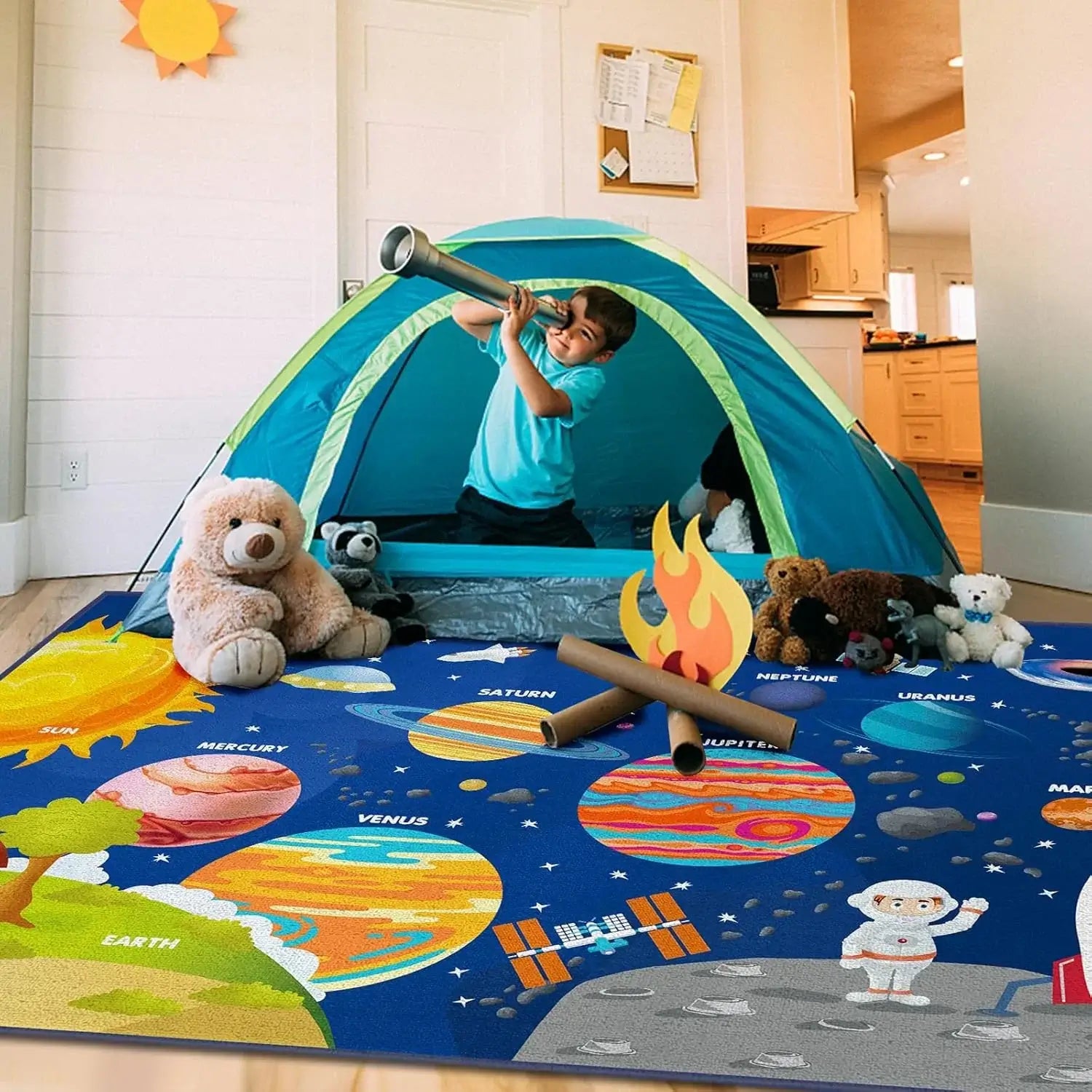
Space and Astronomy Themes
Dark blues, deep purples, and black carpets provide perfect foundations for space-themed rooms. Add metallic silver or gold accents through accessories to represent stars and planets. Consider carpets with subtle star patterns or galaxy-inspired designs.
Princess and Fantasy Themes
Soft pinks, lavenders, and ivory carpets work beautifully for princess-themed rooms. However, don't limit yourself to traditional choices—jewel tones like emerald green or sapphire blue can create more sophisticated fairy-tale atmospheres.
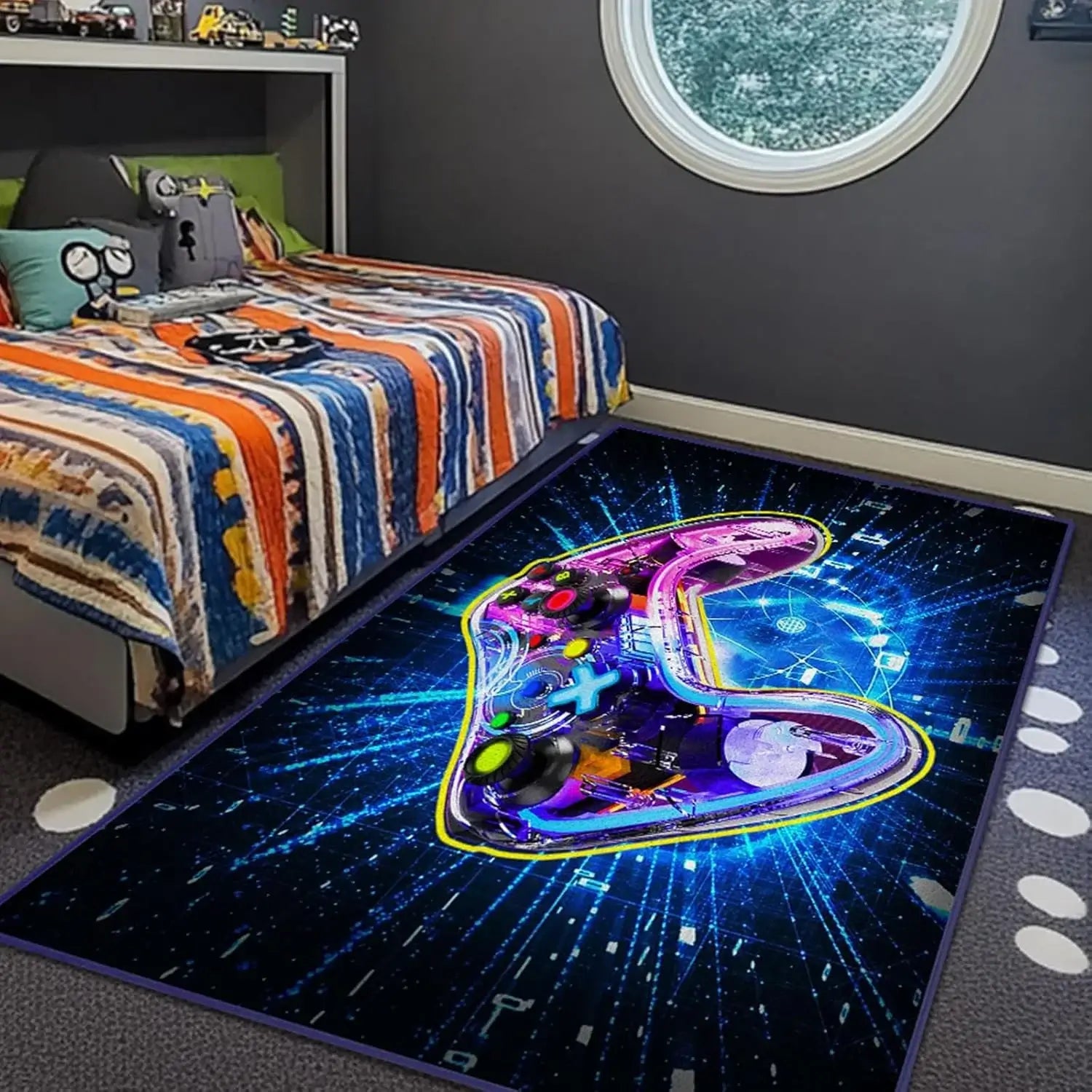
Sports and Activity Themes
Bold, energetic colors work well for sports-themed rooms. Team colors provide natural coordination opportunities, while classic combinations like red, white, and blue create all-American sports atmospheres.
Ocean and Underwater Themes
Various blues, from pale aqua to deep navy, create perfect ocean-inspired foundations. Add coral, sea green, and sandy beige accents to complete the underwater adventure theme.
Vintage and Retro Themes
Muted colors like dusty rose, sage green, and cream work well for vintage-inspired rooms, while bright oranges, teals, and yellows create fun retro atmospheres reminiscent of the 1960s and 1970s.
Age-Appropriate Color Considerations
Children's color preferences and needs change as they grow. Consider these age-specific factors:
Infants and Toddlers (0-3 years)
Very young children benefit from softer, muted colors that promote calm and security. Pastels, soft neutrals, and gentle earth tones work well. Avoid overly stimulating bright colors in nurseries, as they can interfere with sleep patterns.
Preschoolers (3-5 years)
This age group often gravitates toward bright, cheerful colors. Primary colors and their combinations work well, but balance them with neutral elements to prevent overstimulation. Consider carpets with educational elements like alphabet or number patterns in appealing colors.
School-Age Children (6-12 years)
Older children often develop strong color preferences and can handle more sophisticated color schemes. They may prefer specific theme colors or want to emulate grown-up spaces. Include children in color selection discussions while maintaining design coherence.
Teenagers (13+ years)
Teens often prefer more sophisticated, adult-like color schemes. Neutrals with bold accent colors work well, allowing them to express personality through easily changeable accessories rather than permanent carpet choices.
Shared Rooms
When siblings of different ages share space, choose colors that appeal to both age groups. Neutral carpets with colorful accessories often work best, allowing each child to personalize their area while maintaining room cohesion.
Neutral vs. Bold: Finding the Right Balance
Deciding between neutral and bold carpet colors requires careful consideration of multiple factors:
Benefits of Neutral Carpets
Neutral carpets (beiges, grays, soft whites, muted browns) offer maximum flexibility for room changes. They serve as blank canvases that allow furniture, artwork, and accessories to take center stage. Neutral carpets also tend to show less dirt and wear, making them practical choices for high-traffic children's rooms.
When to Choose Bold Colors
Bold carpet colors work well when you want the floor to be a statement piece or when working with mostly neutral furniture and walls. They can energize a space and reflect a child's vibrant personality. Bold colors work particularly well in playrooms where energy and creativity are priorities.
Creating Balance with Bold Choices
If you choose a bold carpet color, balance it with neutral walls and furniture. This prevents the room from becoming overwhelming while still allowing the carpet to make its intended impact.
The Power of Pattern
Patterned carpets can combine neutral and bold elements effectively. A neutral base with colorful pattern elements provides visual interest while maintaining versatility. This approach works particularly well in rooms that need to accommodate changing decor over time.
Seasonal Considerations
Consider how your color choice will feel year-round. A carpet that feels perfect in winter might feel too warm in summer, and vice versa. Neutral colors generally work well across seasons, while some bold colors might feel seasonally specific.
Pattern Mixing and Color Harmony
Successfully combining patterns while maintaining color harmony requires careful planning:
Scale Variation
When mixing patterns, vary the scale to create visual interest without chaos. If your carpet has large patterns, choose smaller patterns for bedding or curtains. Conversely, solid-colored carpets can handle larger patterns in other room elements.
Color Repetition
Ensure pattern colors appear throughout the room to create cohesion. If your carpet contains red, blue, and yellow, incorporate these colors in artwork, pillows, or other accessories to tie the design together.
Pattern Personality
Different patterns convey different moods. Geometric patterns feel modern and energetic, while organic patterns feel softer and more natural. Choose patterns that align with your desired room atmosphere.
Neutral Pattern Anchors
Use neutral patterns as anchors when incorporating multiple colorful elements. A neutral carpet with subtle pattern can ground a room with bold, colorful furniture and accessories.
Cultural and Artistic Influences
Consider patterns inspired by different cultures or artistic movements. These can provide sophisticated color palettes while introducing children to global aesthetics and artistic traditions.
Lighting and Color Perception
Lighting significantly affects how carpet colors appear in children's rooms:
Natural Light Considerations
North-facing rooms receive cooler light that can make warm colors appear muted and cool colors more vibrant. South-facing rooms get warmer light that enhances warm colors and can make cool colors appear grayer. According to lighting design experts at Architectural Digest, understanding your room's natural light is crucial for successful color selection.
Artificial Lighting Impact
Different light bulb types affect color perception. LED lights tend to be cooler and can make warm carpet colors appear less vibrant, while incandescent bulbs warm up colors and can make cool colors appear muddy. Consider your primary lighting sources when selecting carpet colors.
Time of Day Variations
Colors appear different throughout the day as natural light changes. Test carpet samples in your room at different times to ensure you're happy with how the color looks in morning, afternoon, and evening light.
Layered Lighting Solutions
Combine different lighting types (overhead, task, accent) to ensure your carpet color looks good under various lighting conditions. This is particularly important in children's rooms that serve multiple functions throughout the day.
Seasonal Light Changes
Consider how seasonal light changes might affect your carpet color. Colors that look perfect in bright summer light might appear different in the subdued light of winter months.
Gender-Neutral Color Approaches
Creating inclusive spaces that appeal to all children regardless of gender identity:
Nature-Inspired Palettes
Colors drawn from nature—forest greens, sky blues, earth browns, and sunset oranges—appeal universally while creating calming, grounding environments. These colors work well for siblings of any gender and age.
Jewel Tone Sophistication
Rich jewel tones like emerald, sapphire, amethyst, and topaz create sophisticated color schemes that transcend traditional gender associations while providing rich, satisfying color experiences.
Warm Neutral Foundations
Warm grays, creamy whites, and soft beiges provide neutral foundations that work with any accent colors children might prefer as they grow and develop their own style preferences.
Rainbow and Multi-Color Options
Carpets incorporating multiple colors celebrate diversity and inclusion while providing coordination opportunities with various room elements. These choices work particularly well in shared spaces and playrooms.
Cultural Color Traditions
Drawing inspiration from different cultural color traditions can create unique, meaningful color schemes while introducing children to global perspectives and artistic heritage.
Seasonal Color Adaptations
While carpet colors remain constant, you can adapt room coordination seasonally:
Summer Freshness
Emphasize cooler accent colors—blues, greens, and whites—through bedding, curtains, and accessories to create fresh, airy feelings during warm months.
Autumn Warmth
Introduce warm oranges, deep reds, and golden yellows through removable elements to create cozy autumn atmospheres while maintaining year-round carpet color coordination.
Winter Comfort
Add rich, warm textures and deeper color accents through throws, pillows, and wall art to create comfortable, nurturing winter environments.
Spring Renewal
Incorporate fresh greens, soft yellows, and clean whites through accessories and artwork to celebrate spring's renewal energy while working with existing carpet colors.
Holiday Coordination
Plan how your carpet color will coordinate with holiday decorations throughout the year. Neutral carpets provide flexibility for seasonal decorating, while bold colors might limit holiday coordination options.
Common Color Matching Mistakes
Avoid these frequent pitfalls when coordinating carpet colors:
Matching Everything Exactly
Overly matchy room schemes can feel sterile and uninteresting. Instead of matching everything exactly, choose colors that complement and harmonize while providing some contrast and visual interest.
Ignoring Undertones
Colors often have subtle undertones that significantly affect coordination. For example, a gray carpet might have blue, green, or purple undertones that will clash with certain wall colors or furniture finishes.
Forgetting About Wear Patterns
Light-colored carpets show dirt and wear more easily than darker colors. Consider your child's activity level and the room's function when choosing colors that will maintain their appearance over time.
Trend Over Timelessness
While it's tempting to choose trendy colors, remember that carpet replacement is expensive. Choose colors you'll love for several years rather than colors that might feel dated quickly.
Not Testing in Different Lights
Failing to test carpet colors under different lighting conditions can lead to disappointing results. Always view samples in your actual room under various lighting conditions before making final decisions.
Overlooking Existing Permanent Elements
Forgetting to consider permanent elements like tile flooring in adjoining bathrooms or hallways can result in awkward color transitions throughout your home.
Expert Color Coordination Tips
Professional designers use these advanced techniques for successful carpet color coordination:
The Inspiration Piece Method
Start with one beloved piece—artwork, bedding, or a favorite toy—and pull carpet colors from this inspiration piece. This ensures emotional connection and natural coordination.
The 3-Color Rule
Limit your color palette to three main colors plus neutrals. This creates sophisticated coordination without overwhelming complexity that's hard to maintain.
Temperature Consistency
Keep color temperatures consistent throughout the room. Don't mix warm and cool colors unless you're specifically creating contrast effects with professional guidance.
Proportion Planning
Consider color proportions carefully. A bold carpet color should represent a reasonable proportion of the room's overall color scheme, not dominate or disappear entirely.
Future Flexibility
Choose carpet colors that will coordinate with potential future changes. Neutral carpets offer maximum flexibility, while bold colors might limit future decorating options.
Sample Testing
Always test carpet samples in your actual room for at least 24 hours under different lighting conditions. Colors can look dramatically different in showrooms versus your home environment.
Future-Proofing Your Color Choices
Select carpet colors that will grow with your child and adapt to changing needs:
Classic Color Foundations
Choose colors with lasting appeal rather than trendy options that might feel dated quickly. Classic colors like navy blue, forest green, or warm gray provide timeless foundations for evolving decor.
Adaptable Neutrals
Neutral carpet colors allow maximum flexibility for changing themes, color preferences, and room functions as children grow from toddlers to teenagers.
Quality Investment
Invest in high-quality carpets in timeless colors rather than inexpensive options in trendy colors. Quality carpets maintain their appearance longer and justify their classic color choices over time.
Coordination Flexibility
Choose colors that coordinate with a wide range of accent colors, allowing easy room updates through accessories, bedding, and wall art without carpet replacement.
Multi-Functional Considerations
Consider how the room might function differently as your child grows. A nursery becomes a toddler room, then a study space, then potentially a teen hangout. Choose colors that work across these different functions.
Conclusion
Successful carpet color coordination in children's rooms requires balancing multiple factors: color theory principles, psychological impacts, existing room elements, age-appropriate considerations, and future flexibility. The key lies in creating harmonious color relationships that support your child's development while maintaining design coherence and practical functionality.
Remember that there's no single "right" color choice—the perfect carpet color is one that coordinates beautifully with your specific room elements, supports your child's needs, and brings joy to your family's daily life. Quality carpets from Booom Jackson offer extensive color options designed to coordinate with diverse design styles while providing the durability and comfort children's rooms demand.
Whether you choose neutral foundations that allow maximum decorating flexibility or bold colors that make confident statements, successful color coordination creates environments where children can thrive, play, learn, and grow. The investment in thoughtful color selection pays dividends in daily enjoyment and long-term room functionality.
Take time to analyze your space, understand color relationships, and consider your child's current and future needs. With careful planning and attention to coordination principles, your carpet color choice will anchor a beautiful, functional room that supports your child's development while reflecting your family's unique style and personality.
Leave a comment
This site is protected by hCaptcha and the hCaptcha Privacy Policy and Terms of Service apply.